60 Minute Makeovers
Because small changes can make a big difference
BIC
BIC is a family-owned company founded in 1944 by Marcel Bich with his partner, Édouard Buffard, as a maker of writing instruments parts. Marcel Bich adapted and improved the ballpoint invented by the Hungarian László Biró, and in December 1950 and launched his own ballpoint pen in France under the BIC brand, a shortened and more memorable version of his own name. The quality and affordable price of the BIC ballpoint pen meant that it is quickly adopted by an increasing number of consumers.
Wellman
Vitabiotics was founded in 1971 by Karjar Lalvani, father of BBC ’Dragon’ Tej Lalvani. Vitabiotics distributes popular brands such as Wellman, Perfectil and Pregnacare in more than 100 territories, building a £300m enterprise in the last decade alone. Wellman is the UK’s number one supplements brand with a mission to ’live life well’ and also caters for women, teens, children and babies (through affiliated ‘well’ brands).
SPAR
Having grown up visiting SPAR stores in the UK and also passing at least four of their stores on my daily commute, I have often pondered how I would change this brand whilst sat in traffic. Surprisingly the current type mark first appeared in 1968 and remains relatively unchanged 52 years later. This type style although innovative at the time hasn’t aged well and looks very dated. It feels more like a 1960s vision of the future, more akin to NASA than a 21st-century convenience store. The red block seems awkward and unnecessary, and the tree motif is badly proportioned and spaced.
Schär
We’ve subtly tweaked the brand-mark, adjusting the kerning, the relationship of the umlaut and evolved the cumbersome holding device, but largely the mark has remained intact to build on the equity of the brand. The gluten-free market has been re-drawn and now has the freedom to work with the logo or as a symbol in its own right.
Piccadilly Gardens, Manchester.
One of the hottest debates in our home city of Manchester is the future of Piccadilly Gardens. This once sunken oasis of urban greenery and brightly coloured flower beds, has become an eclectic mix of architectural objet d'art, with no real purpose or link to Manchester’s rich heritage or community.
Palmer's
Palmer’s, stocked in over 80 countries, are the #1 Cocoa Butter brand in the world. Specialists in skin, hair and pregnancy care, Palmer’s blend natural ingredients such as Coconut, Cocao and Shea.
Established by the E.T. Browne Drug company after 1971 the brand has enjoyed continued growth and subsequent expansion into new ranges.
GoPro
GoPro is the top of the range market leader in action cameras, it frees people to celebrate the moment and inspires others to do the same. Our refresh cleans up the current brandmark that includes a simple camera/recording symbol that captures the essence of a GoPro. The end 'O' sits as a devise to simply capture life as you live it and share the experience.
Manchester United FC
Over the last few years many clubs have evolved their crest in an attempt to simplify the motif for use in the digital age. One of the more recent and high profile changes was Juventus one of the all-time greats of Italian football.
Wikipedia
As the world’s most popular collaborative digital encyclopaedia, Wikipedia is a house-hold name, and should feel like one. The original logo (designed in 2003 and subsequently refreshed) features a jigsaw piece globe and a classic serif typeface, but arguably lacks the modernity and presence of a digital giant.
Enterprise
This is a brandmark that has frustrated us for a while. The use of the e motif replacing the e in enterprise looks clunky and really awkward. The stretched typeface and the bad spacing add to the dated and uncomfortable feel.
KLM
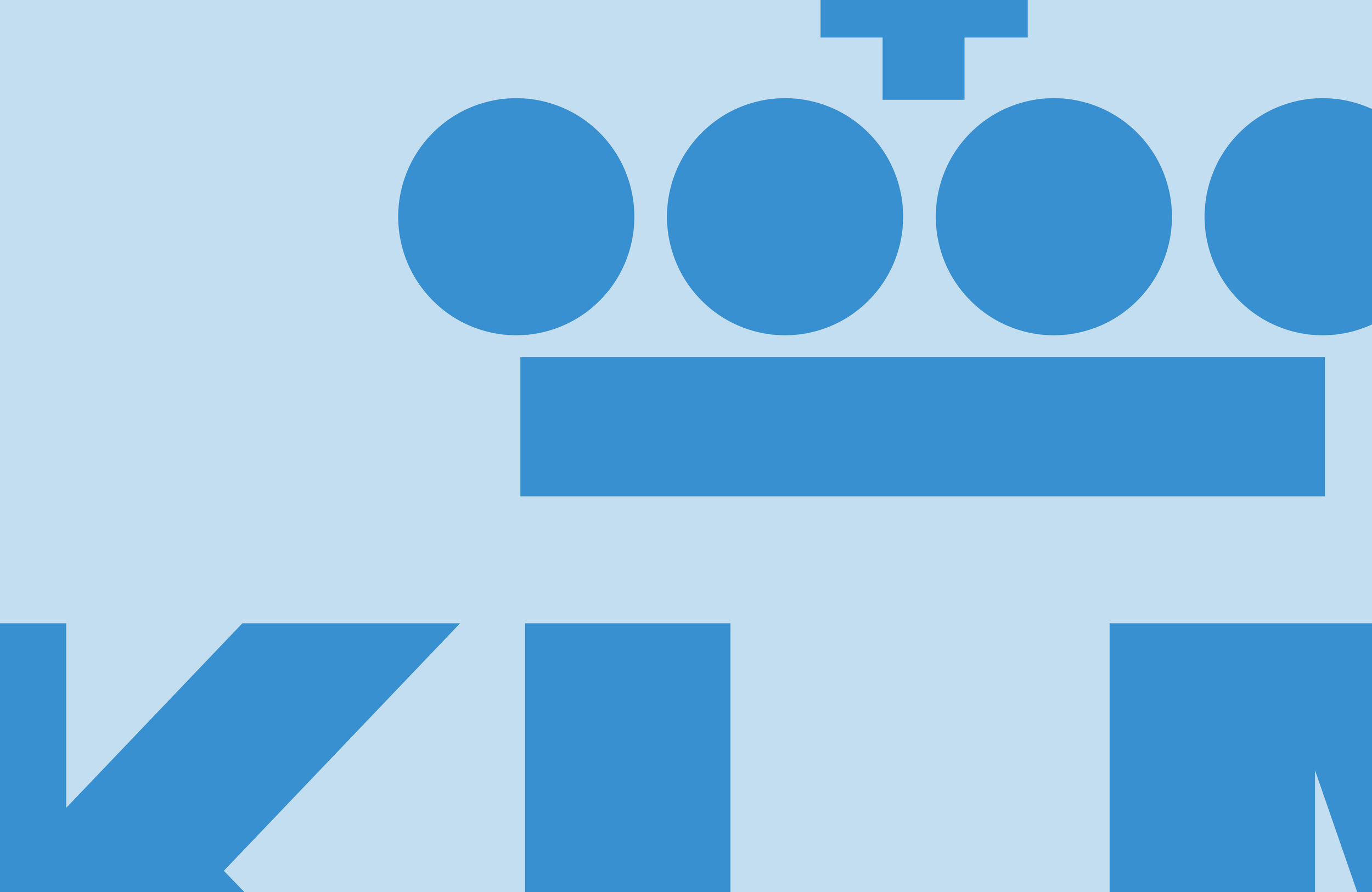
Although the KLM mark is a undoubtable classic, it is looking tired and is in desperate need of a refresh. What we have attempted to do here (in 60 mins remember), is to improve the spacing between the individual elements within the crown to prevent it optically 'filling in' at smaller sizes on screen and in print.
Go Outdoors
60min Makeovers is an internal Truth project where we take a popular brand and refresh it in under an hour. It is just for fun and is undertaken with no insight or knowledge of the brand's future strategy. It is purely cosmetic and for our own pleasure.
60 Minute Makeovers
60 Minute Makeovers is an internal project where we take a popular brand and refresh it in under an hour. It is just for fun and is undertaken with no insight or knowledge of the brand's future strategy. It is purely cosmetic and for our own pleasure.
Have a suggestion for our next makeover? Get in touch!
Follow us


