60 Minute Makeovers
Because small changes can make a big difference
GoPro
GoPro is the top of the range market leader in action cameras, it frees people to celebrate the moment and inspires others to do the same. Our refresh cleans up the current brandmark that includes a simple camera/recording symbol that captures the essence of a GoPro. The end 'O' sits as a devise to simply capture life as you live it and share the experience.
Manchester United FC
Over the last few years many clubs have evolved their crest in an attempt to simplify the motif for use in the digital age. One of the more recent and high profile changes was Juventus one of the all-time greats of Italian football.
Wikipedia
As the world’s most popular collaborative digital encyclopaedia, Wikipedia is a house-hold name, and should feel like one. The original logo (designed in 2003 and subsequently refreshed) features a jigsaw piece globe and a classic serif typeface, but arguably lacks the modernity and presence of a digital giant.
Enterprise
This is a brandmark that has frustrated us for a while. The use of the e motif replacing the e in enterprise looks clunky and really awkward. The stretched typeface and the bad spacing add to the dated and uncomfortable feel.
KLM
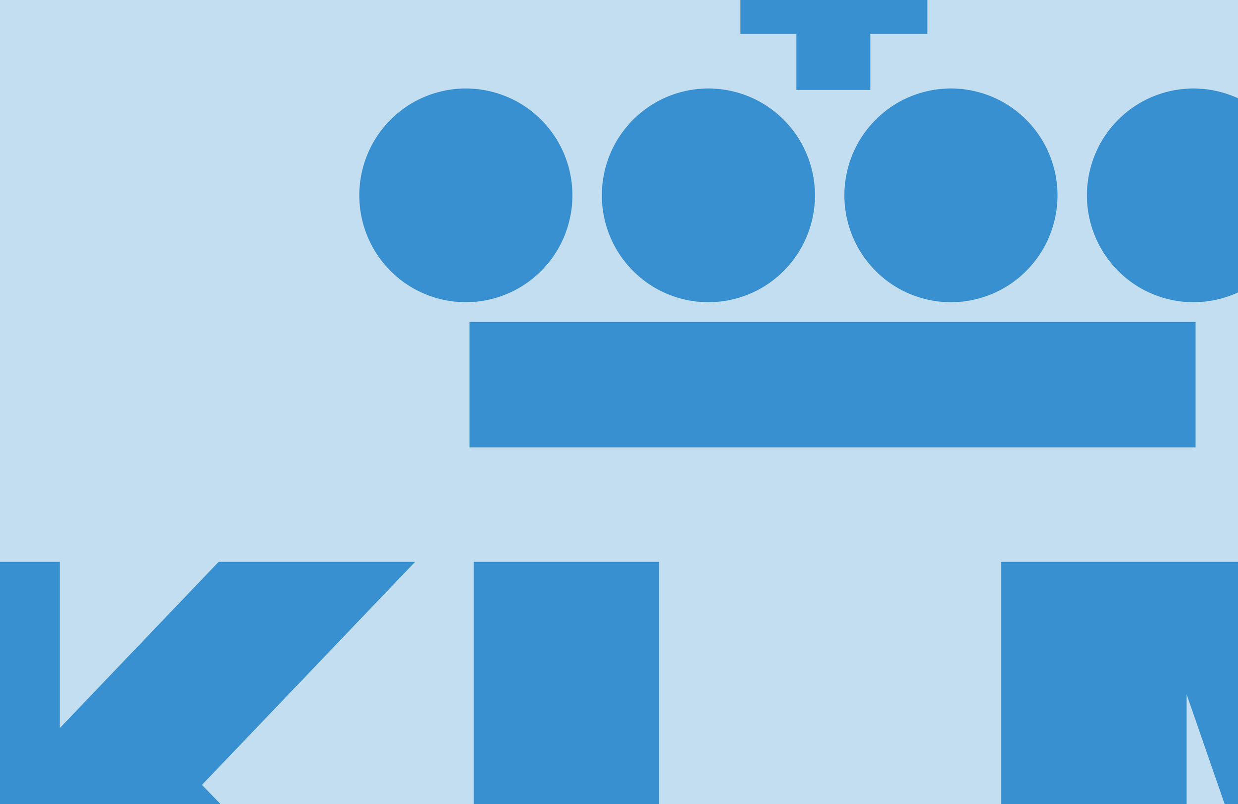
Although the KLM mark is a undoubtable classic, it is looking tired and is in desperate need of a refresh. What we have attempted to do here (in 60 mins remember), is to improve the spacing between the individual elements within the crown to prevent it optically 'filling in' at smaller sizes on screen and in print.
60 Minute Makeovers
60 Minute Makeovers is an internal project where we take a popular brand and refresh it in under an hour. It is just for fun and is undertaken with no insight or knowledge of the brand's future strategy. It is purely cosmetic and for our own pleasure.
Have a suggestion for our next makeover? Get in touch!
Follow us


